Taiwan Design Community Wins 16 Prizes at iF Communication Awards 2009
Proad Image Design leads
2009/12/11 | By CENSAccording to iF Taiwan, 1,368 entries from 24 nations were evaluated for the 2009 iF Communication Design Award, versus 1,290 entries in 2008, 377 of which are award winners, numbering 79 in the digital media category, 11 in the product interfaces, 158 in the print media, 43 in the packaging, 59 in the corporate architecture, 22 in the cross-media, and five in the "too good to be true."

Taiwan once again showed that its talent community is still able to compete at world-class contests by winning 16 prizes or 4.2% of the 377 awards given.
The design firm Proad Image Design from Taiwan emerged as the most successful with four prizes at the coveted global event.
"The debut of the two new categories of product interfaces and packaging was a success," commented Anja Kirschning, project manager for the iF Communication Design Award. But in the other time-tested categories, according to iF, the jury was also treated to a thoroughly successful mixture of high-quality, inspiring projects.
The following profiles give a closer view of the prize-winning designs from Taiwan, courtesy of iF Taiwan, the local branch of the International Forum Design (iF) of Germany.
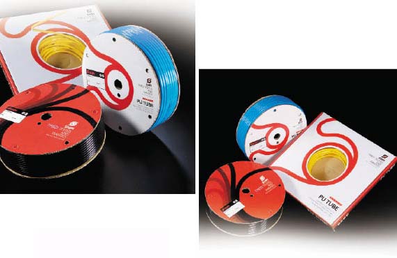
Project Name: PU tube package
Category: 4.1 packaging: Sales packaging
Designer: Subkarma International Associates Co., Ltd. (SHPI)
SHPI has undergone a tremendous face-lift. The new SHPI brand exerts professionalism and dynamism through a clean and color-contrasting visual design expression. Despite being a manufacturer of air hoses and connectors in a "traditional" industry, SHPI's rebranding is apparent through the new brand trademark, color system, slogan and other promotional content. SHPI has gone one step further to offer end-users a fully upgraded brand experience with vibrant and unconventional product packaging.
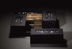
Project Name: Rotatable Notebook
Category: 4.1 packaging: Sales packaging
Designer: Proad Image Design
Inspired by the "Four Museums and One Garden" theme representing the major cultural and historical landmarks in Taipei County, northern Taiwan, the five different notebooks are feature revolving external frame symbolizing the Lin Family Mansion and Garden, with the special window design being one such feature. When the case revolves, it is like opening the gate. And the notebook covers focus on the features of these five landmarks.
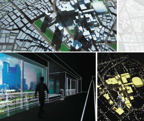
Project Name: Lightscape Twin Towers
Category: 5.5 corporate architecture: Communications media for architecture & public spaces
Designer: SmartJoy Digital Art Co., Ltd.
The Lightscape Twin Towers is a luxury residential landmark to be built in the new urban center of Taipei, capital of Taiwan. To show the convenient traffic flow and lifestyle functions to be available in the neighborhood in the near future, as well as to emphasize the advantages of its height and location, this multimedia design includes scale models of structures with animation videos to allow viewers a realistic bird's-eye perspective. The design achieves the key communication task of enabling potential owners to see the future development of the area and its upmarket life quality.
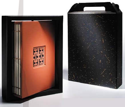
Project Name: Early Taiwan Scenes
Category: 4.1 packaging: Sales packaging
Designer: Good Studio Innovation Co., Ltd.
TTSHOE is a NGO (Non-Governmental Organization) skilled in traditional straw weaving and teaching. With the help of Good Studio in aesthetics and processing, they develop packaging flavored with Taiwanese characteristics and eco-concepts. This packaging design was made by TTSHOE and directed by Lin Bi-hsia, and features early farm paraphernalia in Taiwan, including aboriginal boat shape for the mushrooms, hay bale for tea can, grandma's bag for vacuum rice pack, and worker's head band for rice wine.

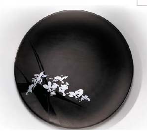
Project Name: Orchid Pattern
Category: 4.1 packaging: Sales packaging
Designer: Proad Image Design
Proad Image adopts the classical beauty of orchids to enhance Orchid Pattern Dining Ware, aiming to maximize the flavor of culinary experiences. Orchids grow with minimal sunlight, and continue to emit aroma. Using the restrained and serene elegance of orchids is perfect for adding charm to dining without being overpowering.
Project Name: World Games
Category: 3.1 print media: Image
Designer: Leslie Chan Design Co., Ltd.
Helping to support the 2009 World Games to be held in Kaohsiung, southern Taiwan, this design features the "Mustard Seed Garden Manual" style of Chinese painting technique, blended with contemporary geometric images to express sportsmanship in the Orient and the spirit of modern sports. Such contrast and power of mixing a classical Chinese style with modern geometry creates striking imagery to capture the attention of foreign participants.

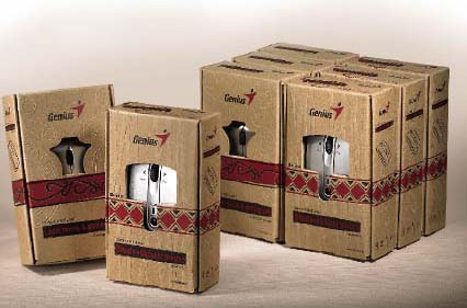
Project Name: Genius Mouse Series
Category: 4.1 packaging: Sales packaging
Designer: Kye Systems Corp.
This packaging design reflects the "primitive" and "eco-friendly" culture of the Austronesia tribes (Bunun and Maori). The rhombus pattern and embossing resemble a "Chinese copperhead" and "straw" from the Bunun who respect nature. The left box means "Kiaora! Kiaora!" (nose-touching ritual), and "ToMoKo" (face tattoo) displays Maori tribal art. The usage of red and black on the packaging represents the corporate identity. In addition, using the golden ratio enhances visual harmony. By minimizing ink and waste, using Kraft paper, the design is consistent with the spirit of the Genius brand.
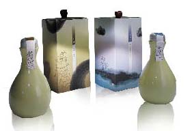
Project Name: Herbal Garden
Category: 4.1 packaging: Sales packaging
Designer: Proad Image Design
With Zhang Zhongjing as the logo, the great master of traditional Chinese medicine, this packaging design evokes the spiritual goal of Eastern Herbal Garden. The background showing a steaming cauldron symbolizes the compassion and perseverance needed to provide medical care, while the supple Rangoon creeper and the purslane tell the healing power of Mother Nature. Earthy colors, signifying traditional Chinese medicinal herbs, are adopted for the delicate design of the logo, with the elegant fonts accentuating the functions of Eastern Herbal Garden.
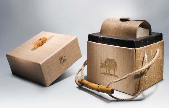
Project Name: Blessing Cultivated
Category: 4.1 packaging: Sales packaging
Designer: Proad Image Design
Inspired by Taiwan's roots in agriculture and the ox as symbolism for hard work and industry, this packaging design emphasizes the value in preserving Taiwan's traditional culture.
The unadorned beauty of rice grains on stalks is represented through using low-chroma earth-tones and eco-friendly materials. Combined with a handle made of jute strings and bamboo, the design achieves an overall sense of rustic simplicity, making the packaging a readily-apparent souvenir praising Taiwan's rice culture, as well as cultivation of prosperity through hard work.
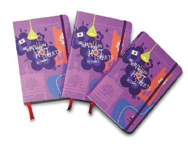
Project Name: Hot Streets in Taipei
Category: 3.7 print media: Publishing media
Designer: Right and Left Design Co., Ltd.
"Hot Streets in Taipei" is a handbook that introduces with popular slangs 12 different shopping streets. Conveniently, practically showing shopping streets and districts that were set up with governmental assistance, the handbook contains information in Chinese and English, including many illustrations and pictures. The cover, in an elegant purple background, combines images of characteristic products available in each shopping street into layers, pop art style.
Project Name: Tomax Seasoning
Category: 4.1 packaging: Sales packaging
Designer: Chart Design
This container designed for the exotic seasoning series with the "Why for you" brand breaks away from conventional container design. Inspired by the brand name "Why for you," which is provocative, the design strives to maximize visual impact within the limited space on the containers. Sitting on a rack, the container's brilliant colors will surely capture attention for being a strong contrast to the conventional, neutral colors typically used by other seasoning brands.

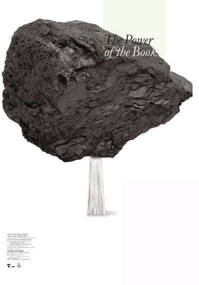
Project Name: Power of The Book
Category: 3.1 print media: Image
Designer: Leslie Chan Design Co., Ltd.
Aiming to visualize the explosive power of enlightenment after reading a book, which is otherwise silent, this poster graphically conveys the sudden surge of strength right after appreciating the message in a book, comparable to that used to lift a heavy stone. The poster gives a tangible, shocking view of an otherwise quiet mental process.
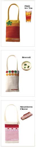
Project Name: Tale of Dessert Bags
Category: 4.1 packaging: Sales packaging
Designer: MOS Burger
These cellphone holders or bags designed as promotional souvenirs and Christmas gifts for MOS Burger adopt sock fabrics. Besides being inspired by MOS Burger foods, the designer also somehow turned, for examples, fruit ice tea and matcha au lait into gradient stripes, with broccoli soup and strawberry cheesecake converted into dots and diamond patterns. Also naming each cellphone bag with a product name makes for easy identification, while adding chic allows these items to be ideal promotional tools for MOS Burger.
Project Name: Tomato Flash Computex 2008
Category: 5.1 corporate architecture: Tradeshow appearances/Exhibitions
Designer: DesignHouse
Taking the literal meaning of the Tomato Flash, DesignHouse created a display stand at the Computex for the flash memory maker. Tapping 3D concepts, the designer adopted colorful tomato stalks as the key visual point, with the booth featuring curved lines to symbolize flash card as magical, playful and amazing. One side of the booth allows giving away sponge tomatoes as souvenirs, with the other side being a "tomato amusement park." The tomato premiums achieve brand impression in visitors.

Project Name: RSL Resort
Category: 3.1 print media: Image
Designer: Proad Image Design
Accentuating the natural gifts in Suao, Yilan County of northeastern Taiwan, the designer created a brochure for RSL Construction, who is building a five-star hotel, the only one globally to offer both hot and cold springs. With Suao's wetland and waterfowl refuge sheltering 3,000 teals each winter, the teal is used as the hotel mascot. Images of bubbles, water beads emphasize cold spring's coolness, with graphics of fern, misty ambience, and ancient trees symbolizing Suao's tranquil, natural environment. And the minimalist tea service and simple stones evoke the Zen state attainable at this resort.
Project Name: Again, New Beginning
Category: 4.1 packaging: Sales packaging
Designer: G-idea Group
Created for Jiu Zhen Nan (est. 1890), one of the oldest and most beloved pastry brands in Taiwan, this lunar New-year gift box was inspired by candy trays found in almost all homes, and used during New Year to hold an assortment of candies and cookies for visiting family and friends. Aiming to achieve the anticipation of opening a treasure trove of tasty treats, the designer succeeds in creating such experience, and creating convenient access to make enjoyment fast and easy. The four black trays symbolize the four seasons, with the gold tray in the middle being the rising sun, which signals a grand beginning to the New Year, hence the name "Again, New Beginning."